 ,
,
March 31, 2016
Voter anger and economic dissatisfaction are upending this year’s Presidential primaries. In addition to the traditional partisan divide between Democrats and Republicans or Liberals vs. Conservatives, perhaps an even more profound divide is among people who believe the economic glass is half full vs. those who believe it is half empty. Compounding the problem is the segment of American society who believe their glass used to be full until someone stole half of it. We are optimistic that the economy will continue its upward trajectory in terms of growth, job creation and household income, but recognize that many Americans have not yet returned to the level of prosperity they once enjoyed.
The presidential candidates often declare that middle class household incomes stagnated for a generation. Stagnation implies incomes were flat. In fact, from a political point of view the situation was much worse. After rising faster than inflation for many years, median household income peaked in 1999 and subsequently declined. The past 15 years of declining incomes violated expectations of sustained economic advancement.
As you can see in Chart 1, stagnant is the wrong word to describe household income over the past 30 years. Volatile is more accurate. When the technology bubble of the 1990’s crashed median incomes fell for the next 5 years before recovering rapidly in 2005, 2006 and 2007. By mid-2007, median household income was nearing the 1999 peak. At just this very moment of restored prosperity – unbeknownst to the average American – the bottom was falling out from under the U.S. economy. The technology bubble of the 1990’s was more visible, easier to understand, smaller, and therefore more tolerable when it crashed. The financial crisis, by contrast, was opaque, difficult to comprehend, suspiciously sinister (or at least seemed so to many) and much, much bigger.
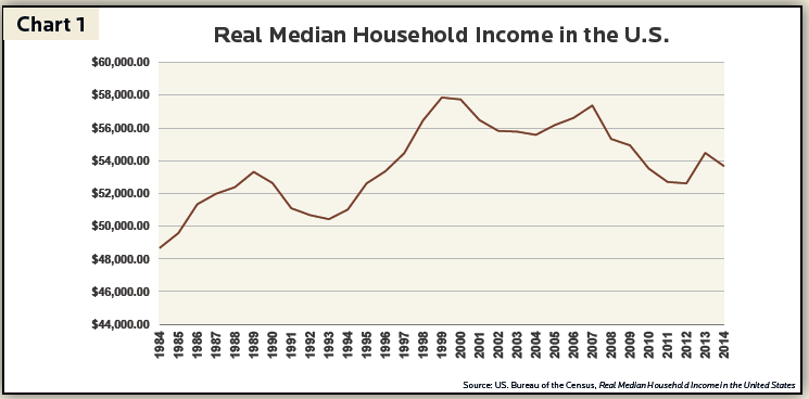
In the aftermath of the financial crisis and Great Recession, median household income once again declined for 5 years. This time at a much faster pace. Unlike the rapid recovery in 2005, 2006 and 2007, however, median household income only started its slow recovery in 2013. Many Americans believe they are paying for the crimes of rich bankers. Understanding the true but complex sources of the financial crisis in the behavior of borrowers, easy monetary policy, excessive financial institution leverage, government policy, derivative securities and global financial markets seems remote and impersonal. Even though the government ultimately earned a profit on the taxpayer funded bank bailouts and many culpable financial institutions went bankrupt, millions of Americans believe justice was not done.
Chart 2 captures another aspect of the current economic and political environment. The official unemployment rate peaked at 10% in October of 2009, a level of hardship Americans had not experienced in nearly 30 years. But, official unemployment only captured part of the problem. A broader measure of unemployment which includes people working part-time but who prefer full-time employment as well as people under-employed in full-time jobs peaked at 17.1%.
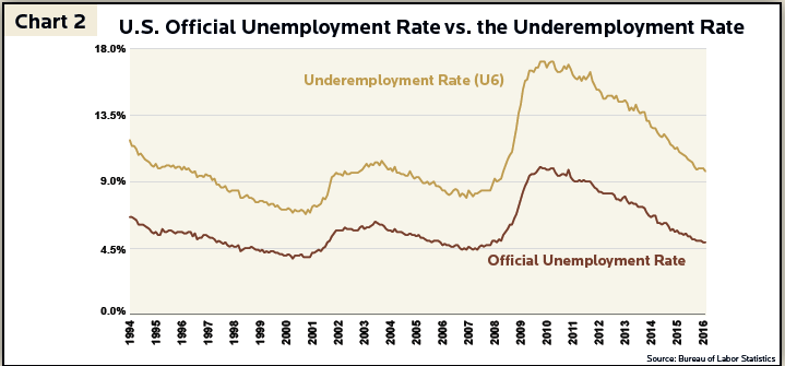
Since the recovery began in 2010, the United States experienced steady job creation bringing the official unemployment rate of 4.9% very close to the pre-financial crisis low. Despite significant improvement, however, the under-employment rate still stands at 9.7% well above the pre-financial crisis level of 7.9% and the pre-technology crash level of 6.8%. Part of the differential stems from the robust job market for people with college degrees relative to the murkier prospects for those without a degree.
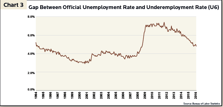
While there are always gaps between the unemployment rate and the under-employment rate, Chart 3 highlights that the gap remains quite wide in this recovery relative to the recoveries of the early 1990’s and the mid 2000’s (Chart 3 merely subtracts the blue line from the orange line in Chart 2 to reveal the wide gap relative to previous recessions and recoveries). This large reserve of under-employed labor will continue to constrain wage increases until these people are employed at levels appropriate to their skills.
Further inhibiting wage increases is an additional reserve of unemployed labor not captured in either the official unemployment rate or the under-employment rate. Chart 4 estimates the gap between current levels of labor force participation vs. expected levels based on demographic trends. The major reasons people typically do not participate in the labor force are education, child care, disability, discouragement or retirement. Some people, therefore, might be lured back into the labor force if suitable jobs became available. The labor force participation rate stood at 66.4% on the eve of the financial crisis and bottomed (thus far) at 62.4% in September 2015.
The red line on Chart 4 measures our expected levels of labor force participation and is decreasing over time. Even prior to the financial crisis more and more young adults chose higher education over direct entry into the labor force, but the Great Recession eliminated many entry level and part-time jobs for teens and young adults. Some accelerated their plans for post-high school education, but many temporarily dropped out of the work force until conditions improve.
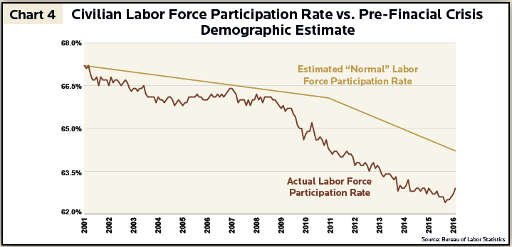
Another important demographic trend is baby boomer retirements. The first baby boomers turned 65 in 2011, kicking off a 20-year period where labor force participation should steadily shrink. The Great Recession accelerated retirement plans for some older baby boomers. Despite these demographic headwinds a percentage of people who dropped out of the labor force would return if appropriate jobs became available. The gap between the actual labor force participation rate and our estimate of available labor in a more normal environment adds the equivalent of 1% – 2% to the official unemployment rate.
When all of the factors listed above are taken together the economy behaves as if the unemployment rate were closer to 8.5% rather than 4.9%. This helps explain the very low levels of current interest rates, anemic wage increases and slowly recovering household incomes. It also helps us understand the anger and frustration among certain segments of the electorate.
We believe the current recovery has a long way to go before it exhausts itself. Over the past several years the U.S. economy created an average of 2.7 million jobs per year (about 225,000 per month). The labor force is expanding by 1.4 million people per year as young people continue to enter the work force, allowing an additional 1.3 million additional people to either take an improved position or re-enter the work force. At this pace the labor market will normalize over the next several years which should lead to more rapid wage increases and faster growth in household incomes.
Contrary to popular perception, the current economic expansion will likely be a long one. Recessions typically begin when labor and other resources are tight, asset valuations are excessive and debt burdensome. At present – and for the foreseeable future – labor and other resources are abundant, most asset valuations are reasonable, and debt is manageable. From our vantage point the glass is half full and slowly but surely getting filled to the top over time. We understand, however, that the expectations of millions of Americans were violated during and after the Great Recession. We hope and believe that the president elected in this environment will not derail the recovery that is both already underway and quite likely to deliver the results the voters seek, perhaps even by 2021 when his or her first term ends.
Investment Insight is published as a service to our clients and other interested parties. This material is not intended to be relied upon as a forecast, research, investment, accounting, legal or tax advice, and is not a recommendation, offer or solicitation to buy or sell any securities or to adopt any investment strategy. The views and strategies described may not be suitable for all investors. References to specific securities, asset classes and financial markets are for illustrative purposes only. Past performance is no guarantee of future results.